Slice
An interior for pizza sold by the slice and by the metre. Blue establishes the main identity colour, alongside stainless steel and white surfaces. Graphic elements, custom lighting and integrated branding form part of the spatial design.
Blue, steel and pizza by the metre.
The display is the first encounter. Pizza sold by the slice and by the metre gives Slice a direct way of presenting its offer, and that idea carries through the design. The counter, furniture, lighting and graphic identity are developed as parts of the same place.
A clear route to the counter
The entrance display introduces the product before the visitor reaches the ordering point. Its stainless-steel base and full-height presence give it the weight of a permanent element within the room. A dedicated lighting line was explored to guide the route towards the counter.
Blue pizza boxes become part of the interior through shelving designed for them. Packaging, signage and illuminated elements belong to the spatial composition, giving the brand a physical presence at the scale of the shop.
A small vocabulary of materials
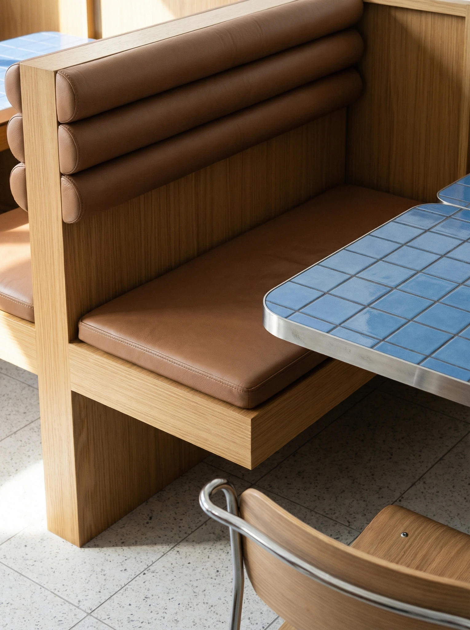
Blue is the principal identity colour. Stainless steel and white surfaces establish the other main notes, alongside the grey terrazzo-effect floor and white-and-blue tiling. The contrast is both visual and tactile: a strong field of colour meets the changing reflections of metal.
Compact stainless-steel tables are developed around a 60-by-60-centimetre format. Back-to-back banquettes organise seating within the room, while the window-side counter gives another way to stop for a slice. Different lengths of visit can occupy the same interior.
The identity is in the room
The phrase ‘SLICE AND SIMPLE’ belongs to the graphic language explored for the space. Lightboxes, the pizza-box shelves and custom lighting allow the identity to appear in several forms. Their placement is considered alongside the layout, so that the name, the product and the experience of using the room tell a consistent story.
Interior and identity design / Description of the developed design direction.